Swatch.com
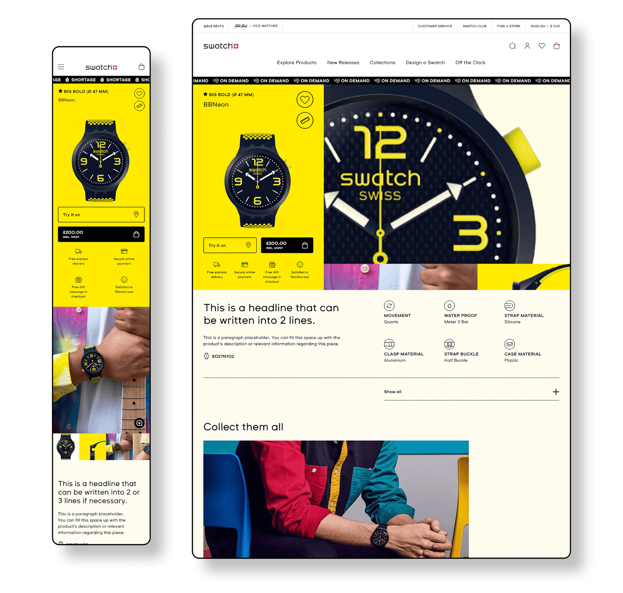
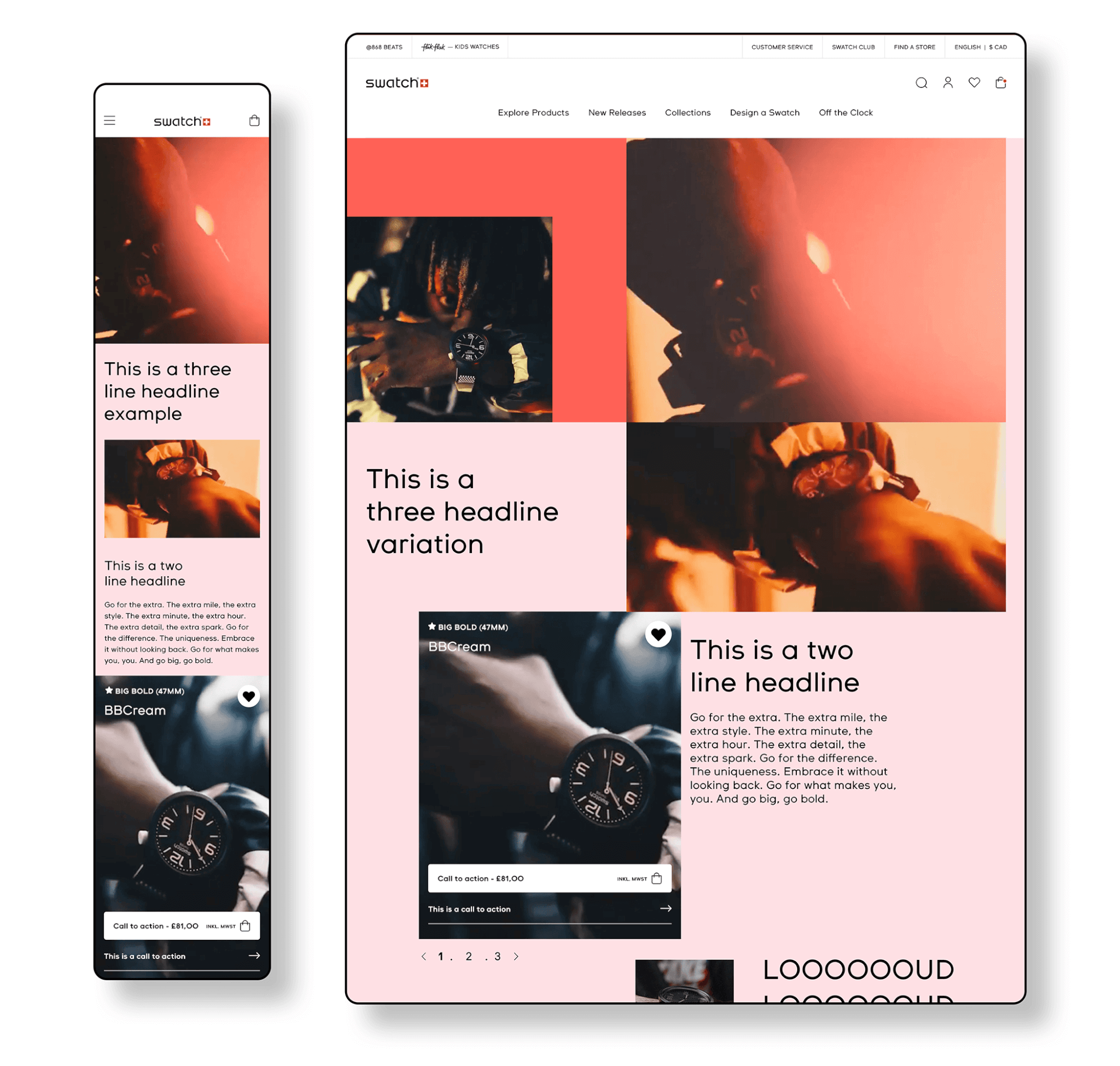
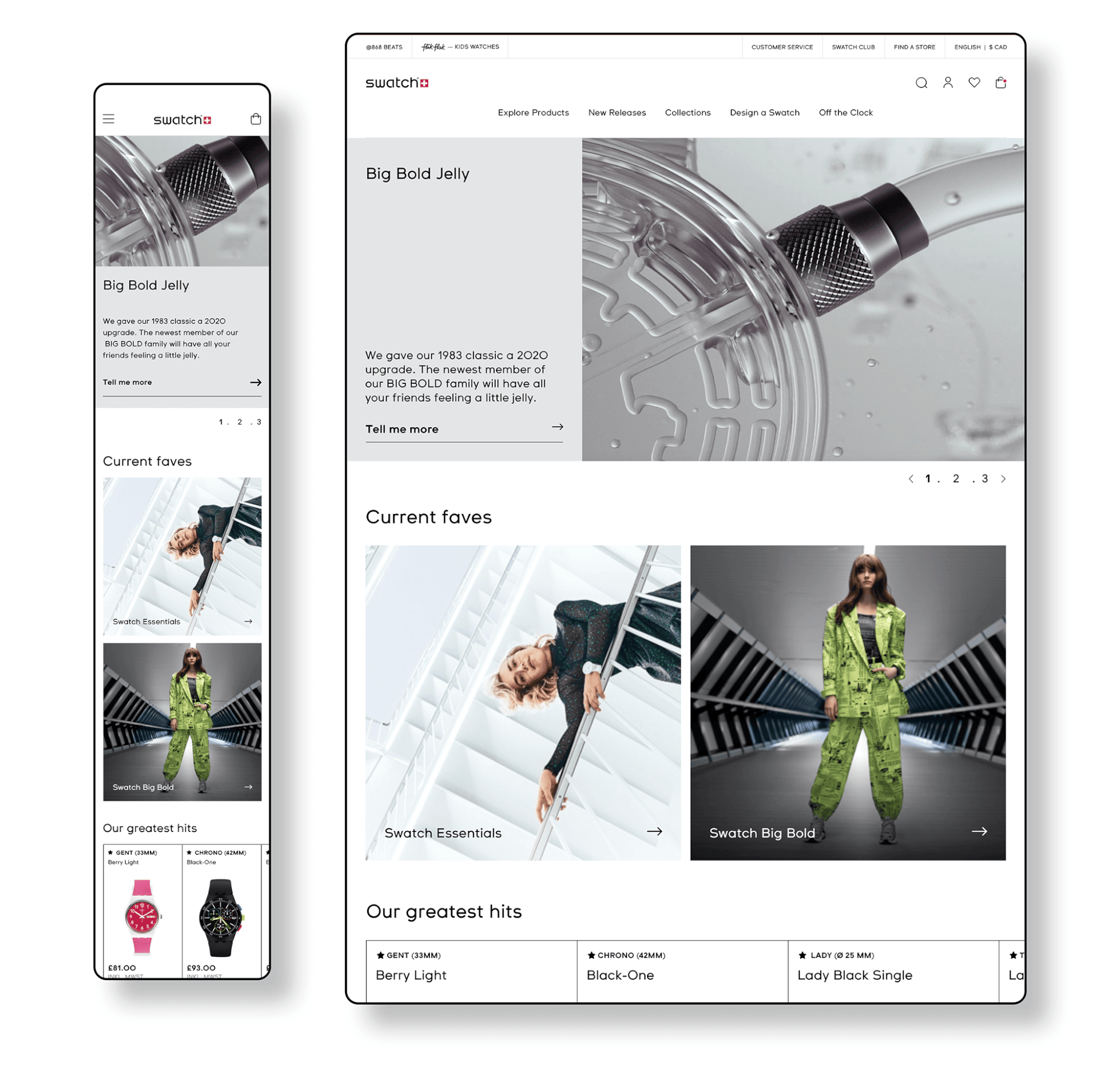
As an extension of the brand, Swatch dot com is meant to be an expression of its joyful, bold personality. When using brand visuals as graphic elements to make the experience uniquely Swatch and combining bold typography, smart colour blocking, and contextual imagery we ensured the product remains the hero of the experience.
Home page, Collection Page, and Product Page
Animations, Erros Pages & Scroll Through
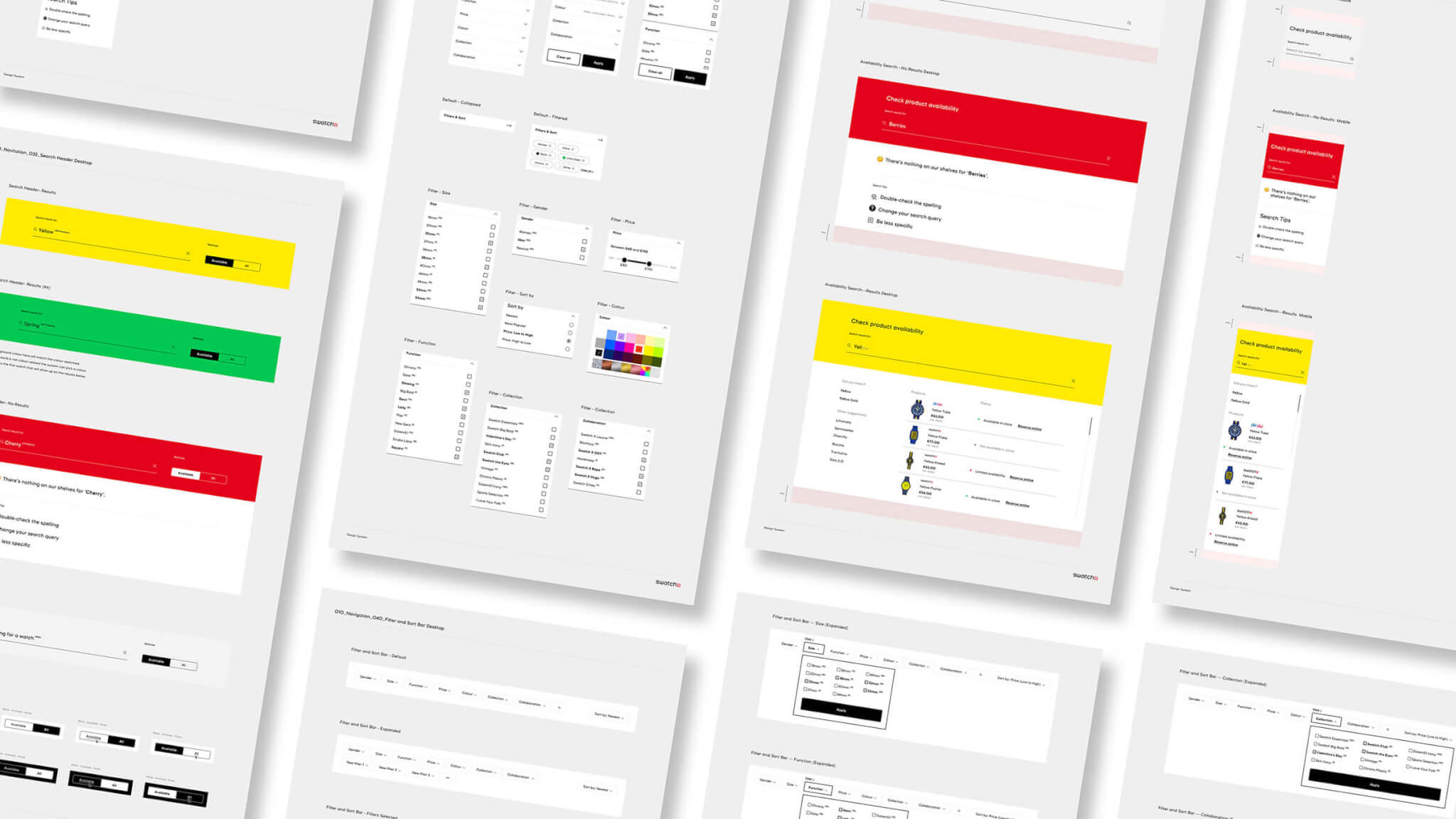
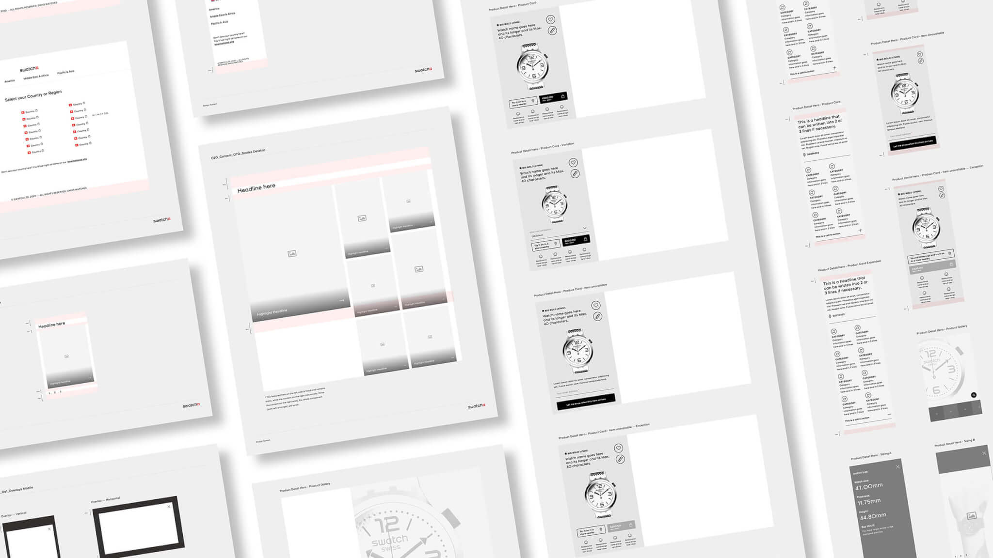
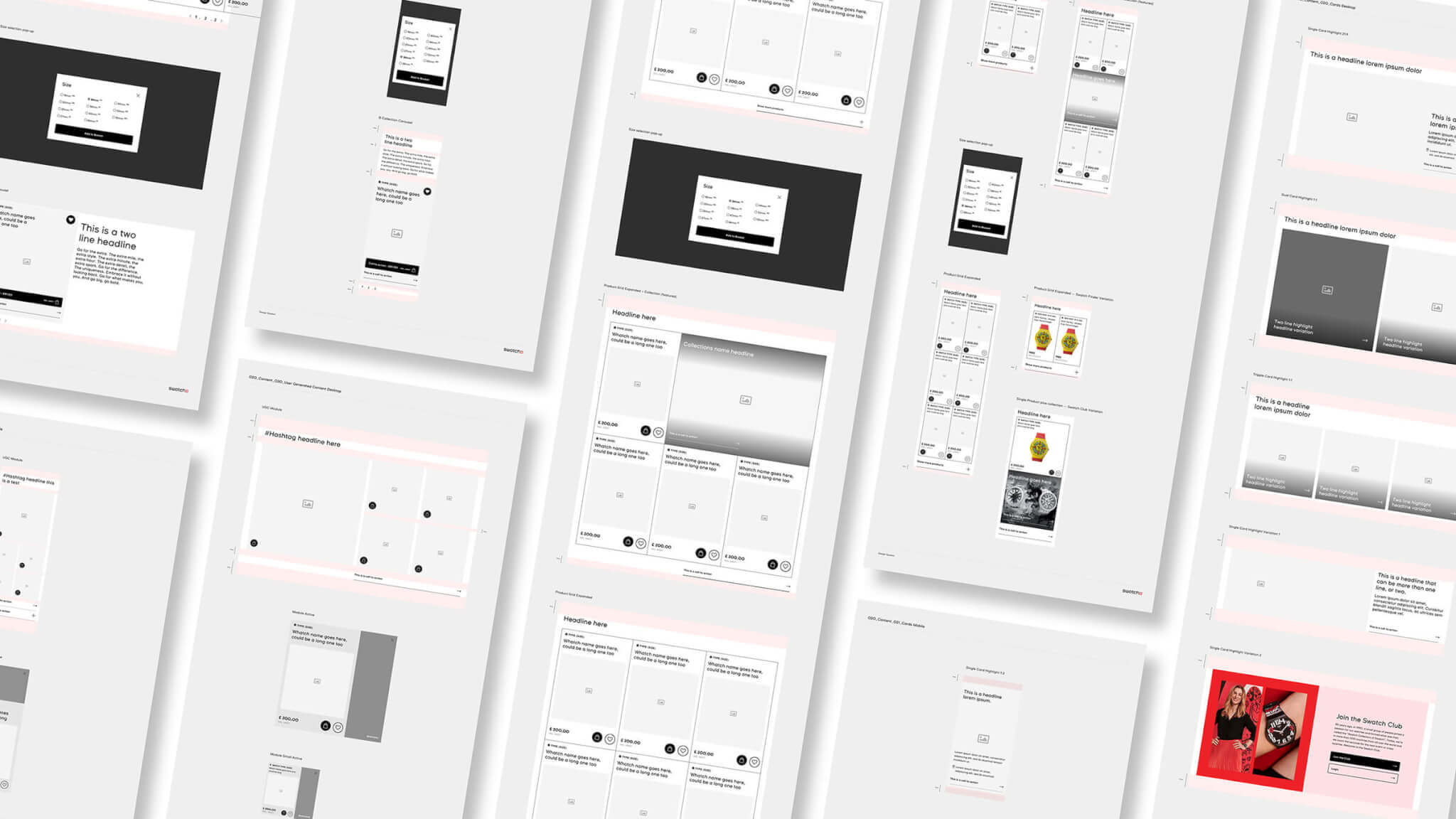
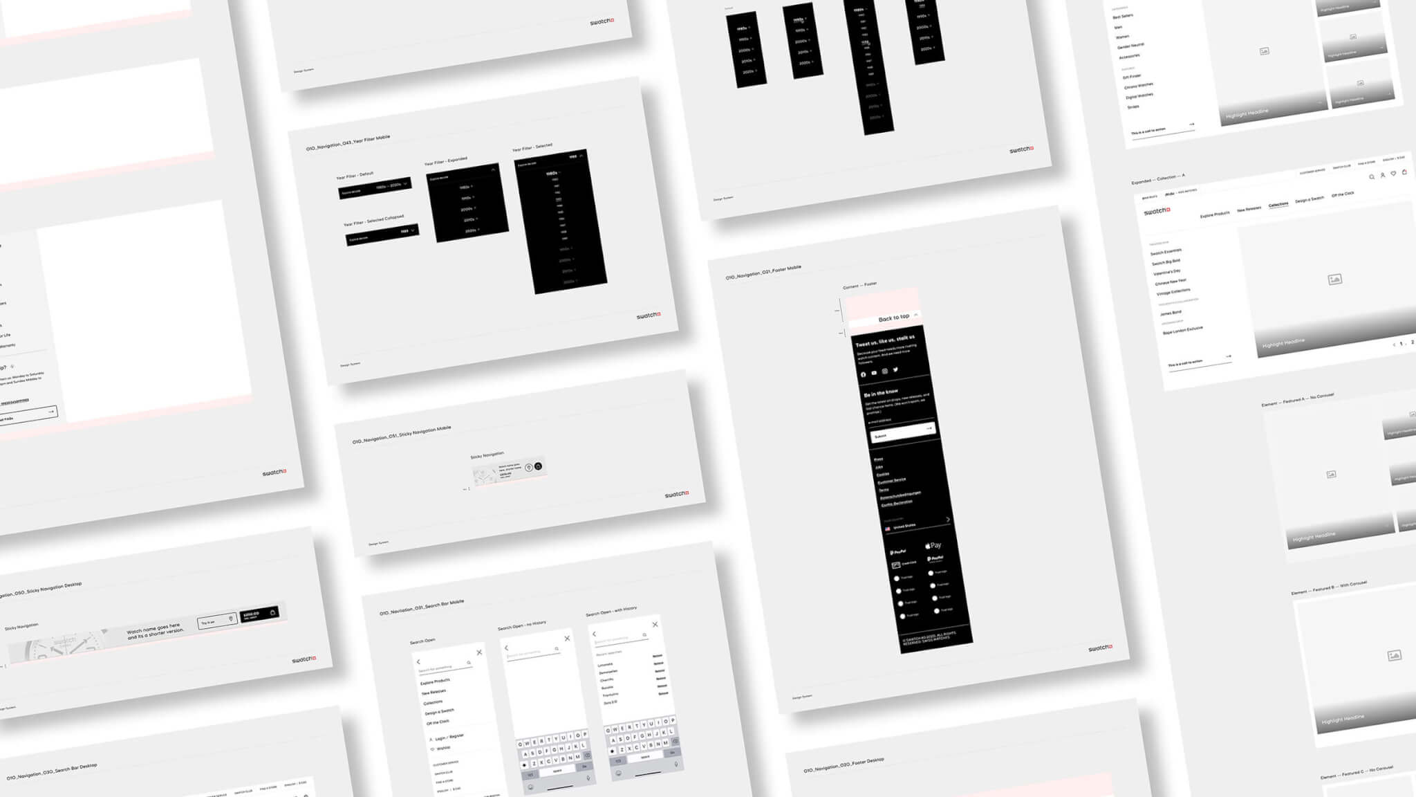
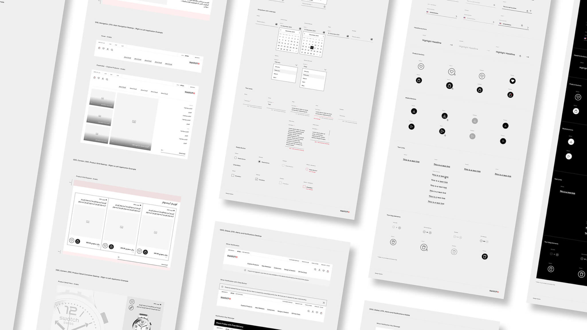
Design System
For this project, we created a whole design system and full templates with a modular library.

Other projects
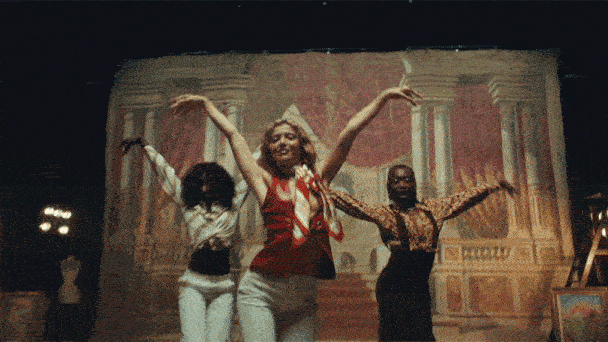
Jungle - Back on 74Brand, Campaign, Interactive
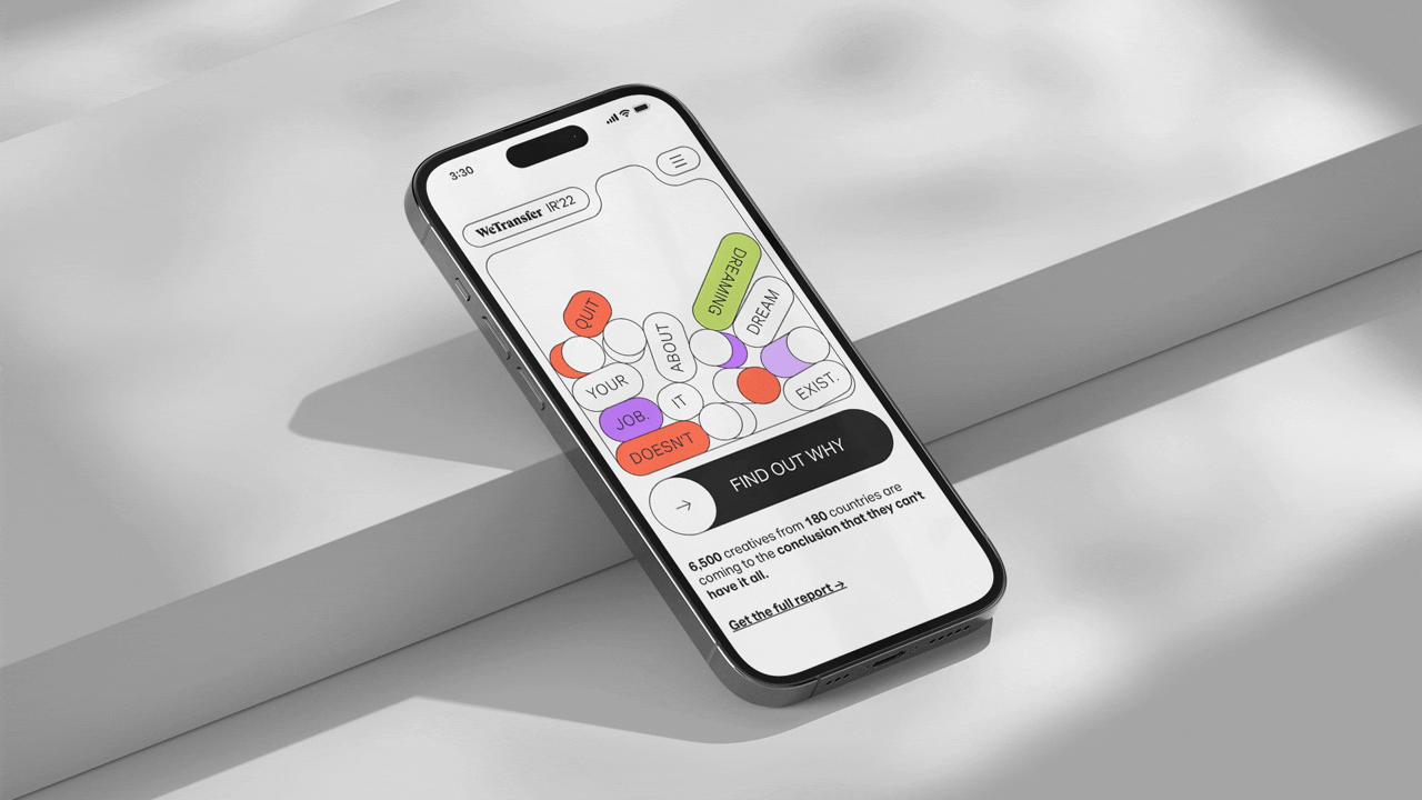
Ideas Report 2022Branding, Interactive, Web, Digital

Ideas Report 2021Branding, Interactive, Web, Digital

Weekend CountdownAdvertising, Social, Digital
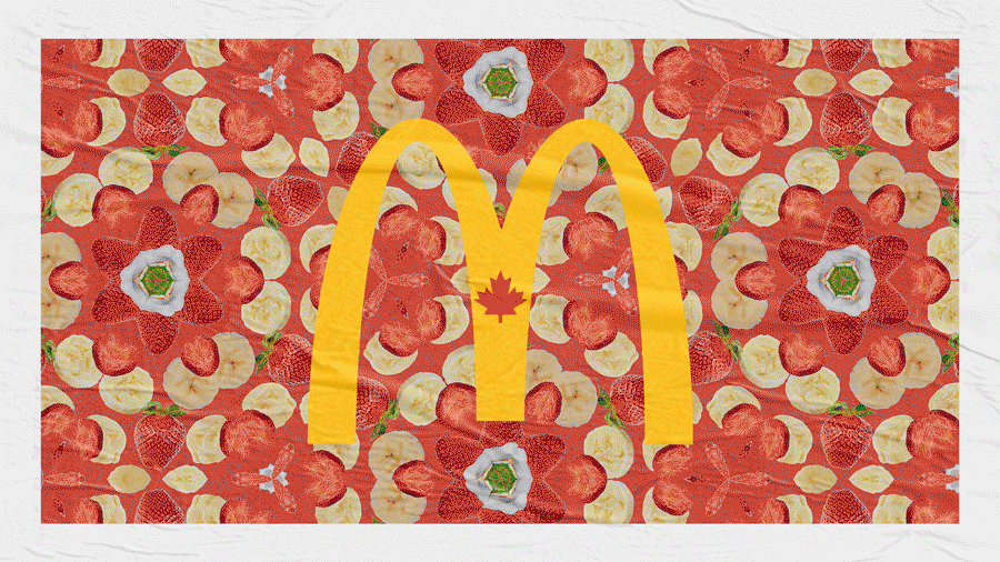
Summer SmoothiesAdvertising, Social, Digital, Graphic Design, Art Direction

PhotographyDigital & Analog Photography
Design ExplorationDesign and Art Direction Exploration
⌜ This site was built using Semplice Studio for WordPress and tweaked by my awesome friend and developer Giulian Drimba. The sans serif typeface used here is called Neue Montreal and was designed by the Canadian type foundry Pangram Pangram®. The base colours used are #121212 (dark gray), #FAFAFA (off white), and #FF3F43 (salmon). ☺ ⌟
● All rights reserved
© 2025 Gabriel Santiago